
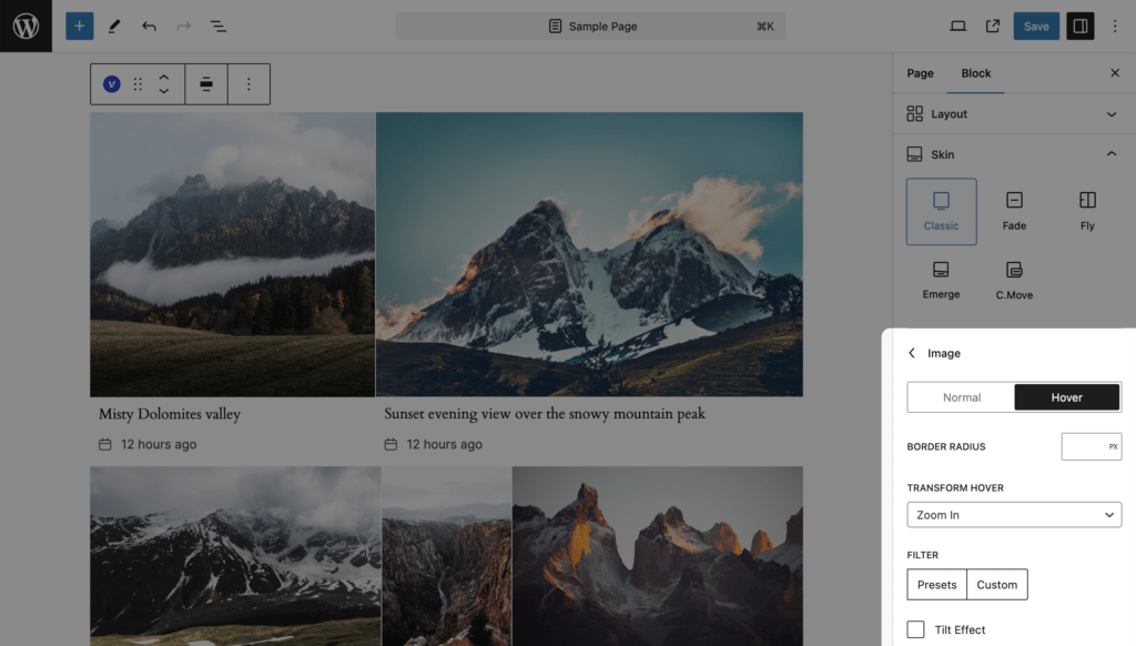
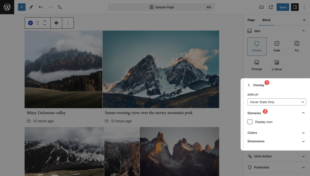
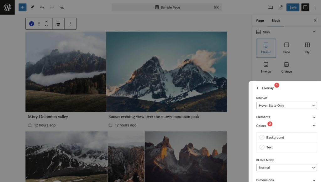
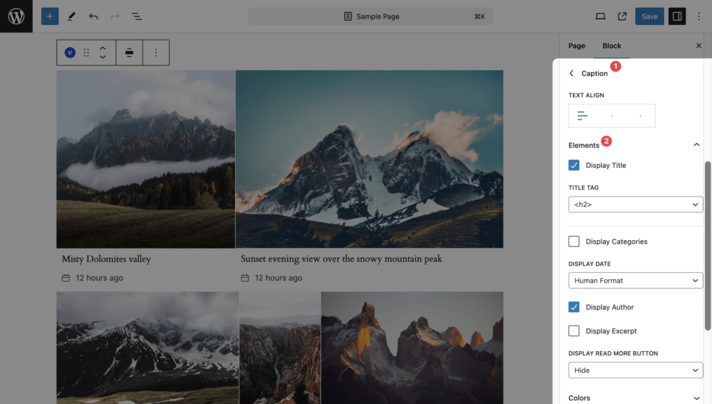
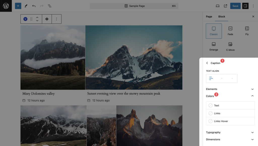
Image on top, caption under it. On hover the image zooms in slightly and, when Display Icon is on, an icon appears over it on a tinted overlay. The caption is always visible; its title and categories are links (Links and Links Hover colors).
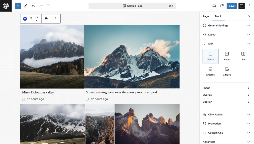
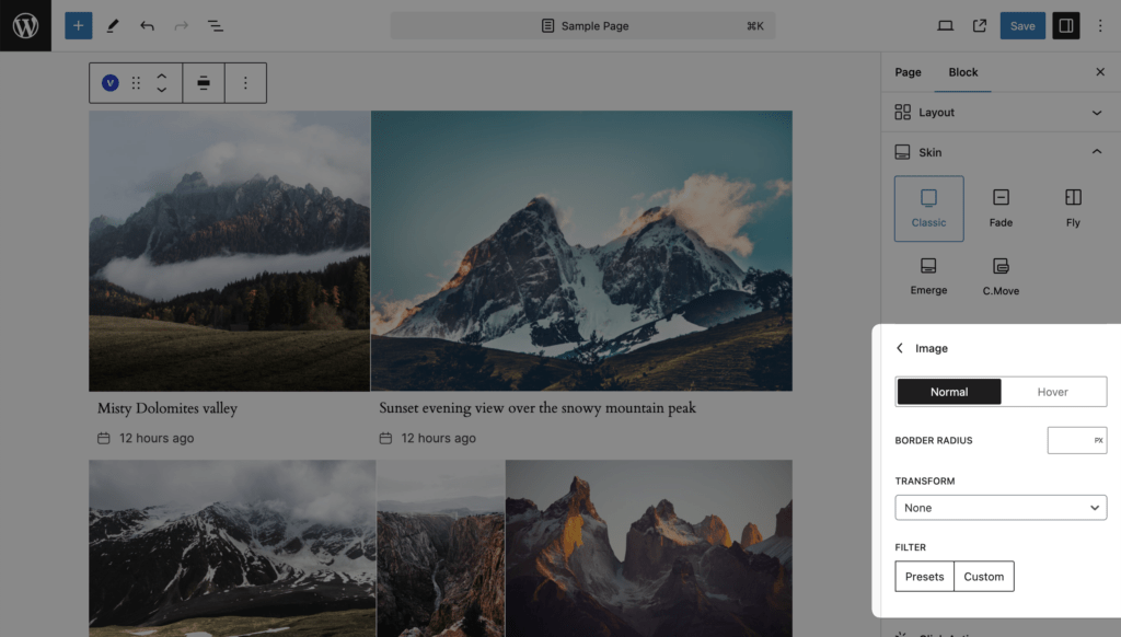
Image
Normal and Hover states. Values and defaults are in the Skin settings reference.
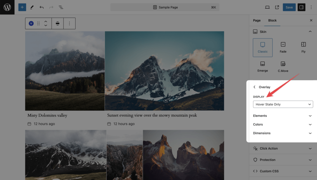
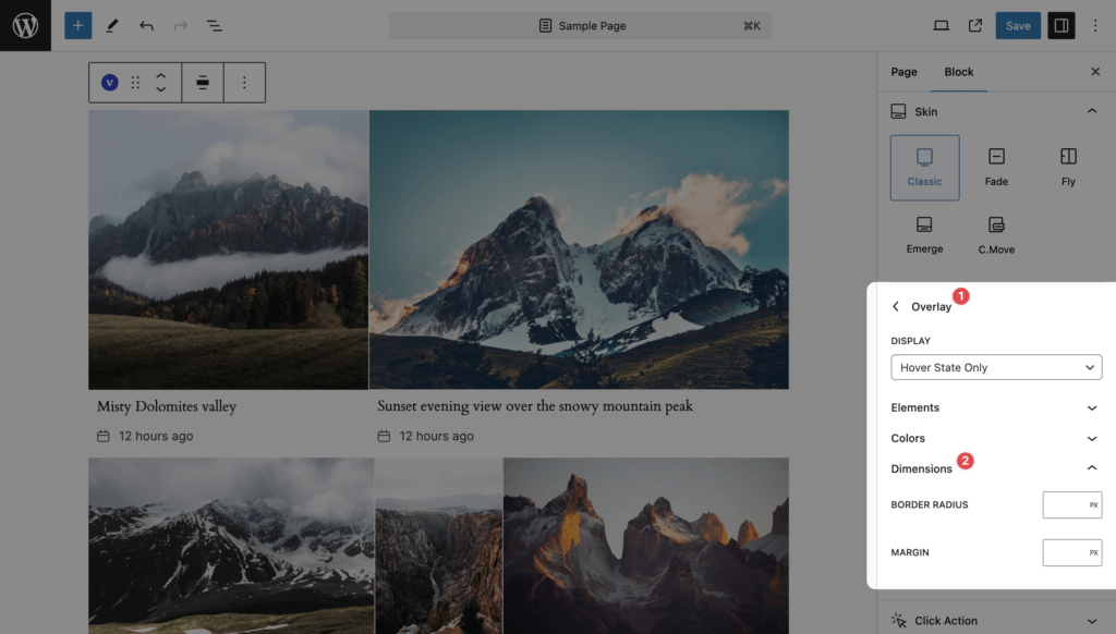
Overlay
Display, Display Icon, Colors and Dimensions.
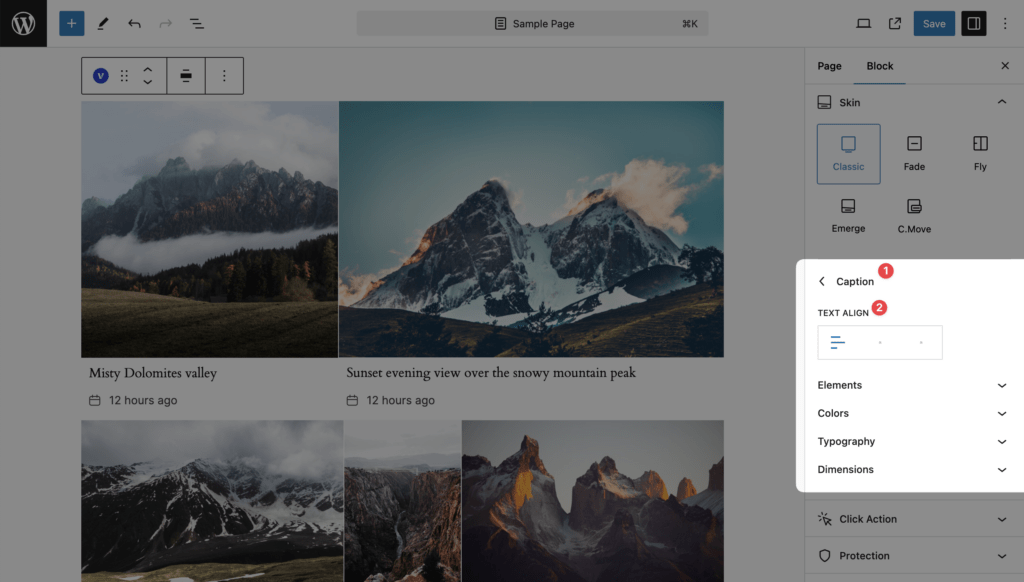
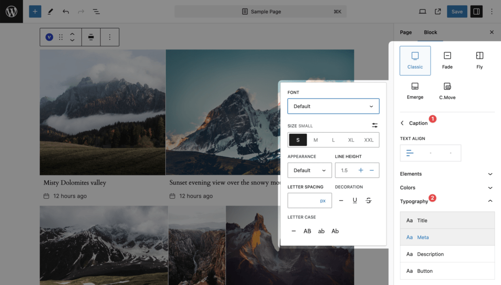
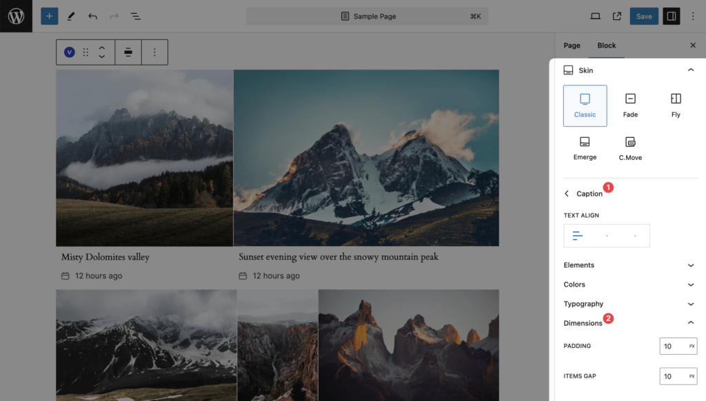
Caption
Text Align, Elements, Colors, Typography and Dimensions.
Notes
- The overlay of this skin carries only the icon. Titles and meta cannot be placed on the image; use Fade, Fly or Emerge for that.
- This is the only skin with the Read More button, and its Typography panel has a Button entry for it.
- Turning Display Icon on with no overlay color set fills the overlay with black at 20% opacity and white text.