A masonry photo gallery graded gray by a CSS image filter until the pointer arrives. The filter offers 17 presets and leaves your files unchanged.
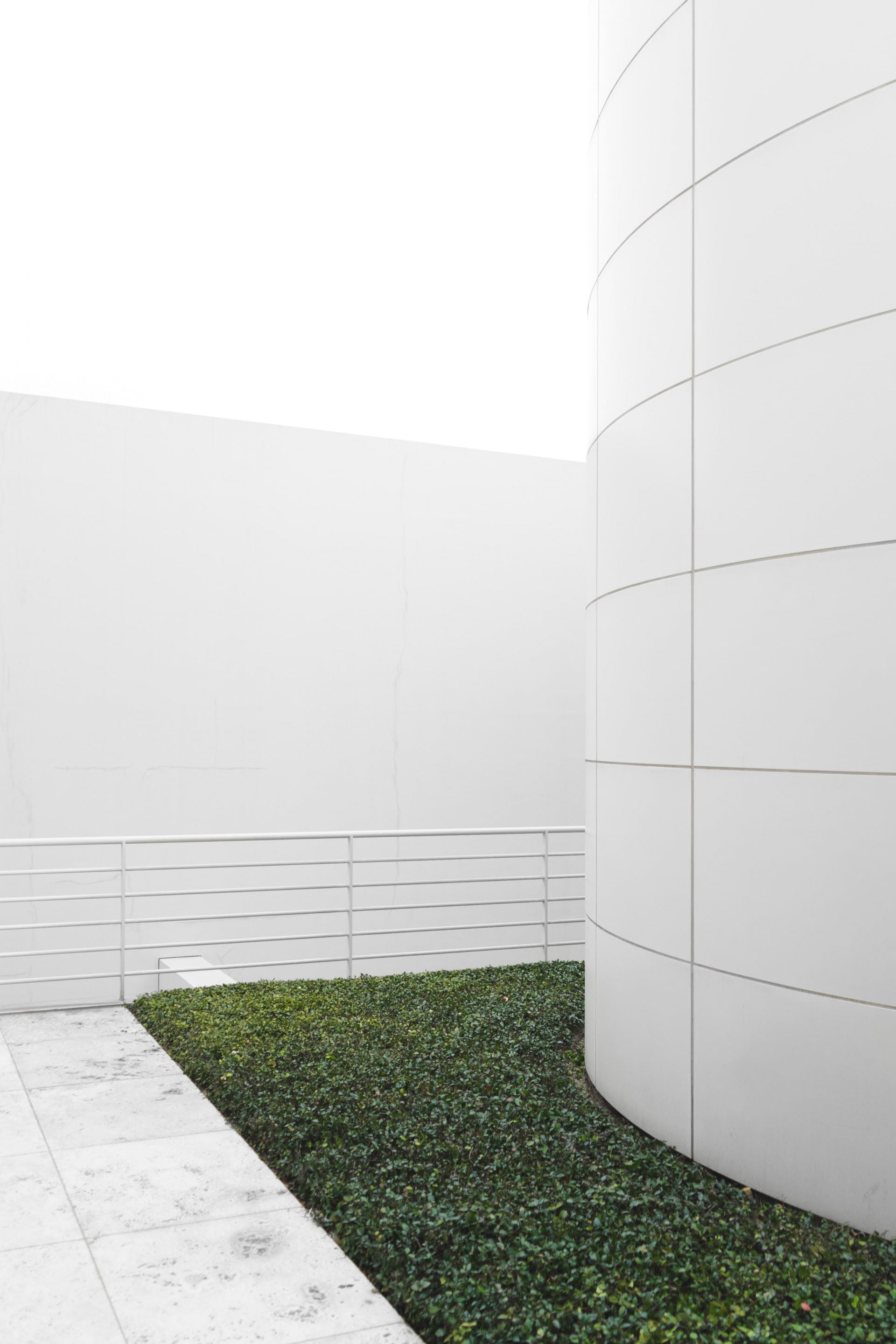

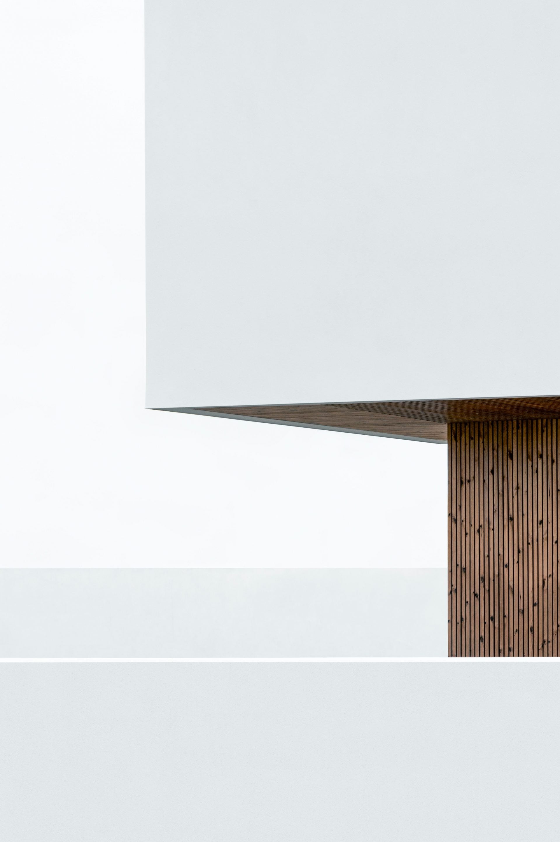


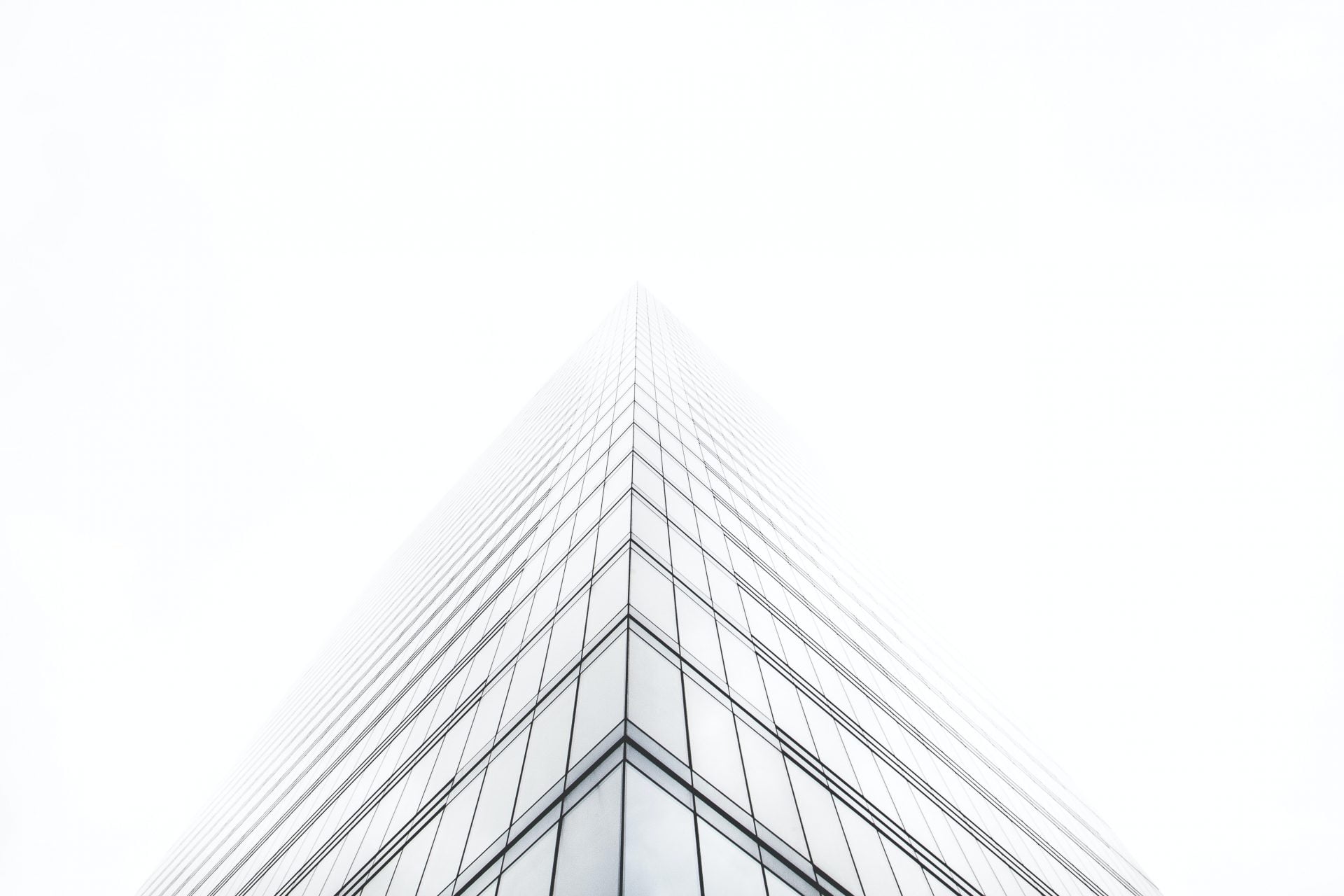

What the image filter does to a masonry gallery
The gallery above is gray until you point at it. Three values do that: brightness(0.86), contrast(1.21) and grayscale(1) on the resting state, with the hover state handed back to the original image. The browser applies them as CSS while it paints, so nothing is written to disk and your Media Library files stay as you uploaded them. Clear the setting and the photographs come back.
The alternative is a graded copy of every photo in the Media Library, two files per image and a re-export whenever you change your mind. Masonry lets each image keep its own height, so tall and wide shots sit together without cropping, and the grade is what makes them read as one set. If the photographs should stay sharp at rest and the effect belongs on hover instead, the masonry gallery with blur hover demo turns the same control around.
Presets, custom values and the two states
Both copies of the control are Pro, and the skin settings reference lists them with their defaults. Normal starts at Original. Hover starts at none, and its CSS is loaded only once you set a value.
- Seventeen presets: 1977, Aden, Amaro, Brannan, Brooklyn, Charmes, Crema, Dogpatch, Gingham, Inkwell, Lo-Fi, Ludwig, Moon, Nashville, Reyes, Skyline and Willow.
- Eight sliders when no preset fits: Brightness, Contrast, Saturation, Grayscale, Sepia, Opacity, Hue and Blur, under a preview thumbnail that updates before you save.
- The same Image tab on all five skins, Classic, Fade, Fly, Emerge and Caption Move.
- Transform beside it. Zoom In scales the image by 5 percent, and the four Move options shift it by 2 percent.
- Tilt Effect, off by default and mouse only, with a Direction of Direct or Opposite.
- Masonry Columns 1 to 5, default 3, and Gap 0 to 200 px, default 15. Vertical Gap is empty, which makes it match Gap.
Applying a filter in three steps
- Add the Visual Portfolio block and pick Media as the source. Click Add Media, choose your images, confirm with Select. In Layout choose Masonry and leave Media Aspect Ratio on Auto, since any other value crops every image to that shape.
- Open the Skin panel, pick Fade, and go to its Image tab with the state switch on Normal. Take one of the seventeen presets, or move to the custom sliders and set Brightness, Contrast and Grayscale by hand.
- Move the switch to Hover and give Filter a second value. The demo puts Original there, which is why the color arrives under the pointer. Leave it alone and the resting grade stays put.
Which parts of this need Pro
Masonry is free. So are the Media source, the Fade skin, the dropdown filter, the lightbox and the AJAX behind it. The grading is not. Filter, Transform and Tilt Effect stay in the panel of the free plugin, with a Premium Only note on them. The free versus Pro table carries the whole split and pricing lists the licenses. There is no trial version. A first purchase can be refunded within 14 days.
- Free: the Masonry, Grid, Tiles, Justified and Slider layouts, the Classic, Fade, Fly and Emerge skins, filtering, sorting, pagination and the lightbox.
- Pro: Filter and Transform, on the Normal state and the Hover state alike, and the Tilt Effect with its Direction.
- Pro: blend modes for the overlay and the caption, Typography, Dimensions, Move Overlay Under Image and the Caption Move skin.
Hover, phones and single images
Does the hover filter do anything on a touch screen?
No. Hover is a pointer event, so a phone shows the resting state and stops there. On this page the gray version is all a phone visitor gets, which is worth weighing before you grade too far. Overlay text meets the same wall, so set Overlay Display to Always, or use Move Overlay Under Image on Pro, as the answer on hover effects describes.
How many columns does this show on a phone?
It steps down on its own. Three columns become two at 768 px and one at 576 px, and five columns lose one at 1200, 992, 768 and 576. Pro moves those widths in Settings, General, Responsive Breakpoints. The answer on masonry columns has the Custom CSS for holding two columns on a phone.
Can one image have a different filter?
No. Filter belongs to the skin, so it grades every item in the block at once. A single image carries its own focal point, title, alt text, categories and format, plus hover media and a custom popup image on Pro, all listed under the Media content source. If you want two treatments on one page, use two blocks.