Organize photos and videos into WordPress album galleries for clearer browsing, hierarchy, and storytelling.

What an album item does in a gallery
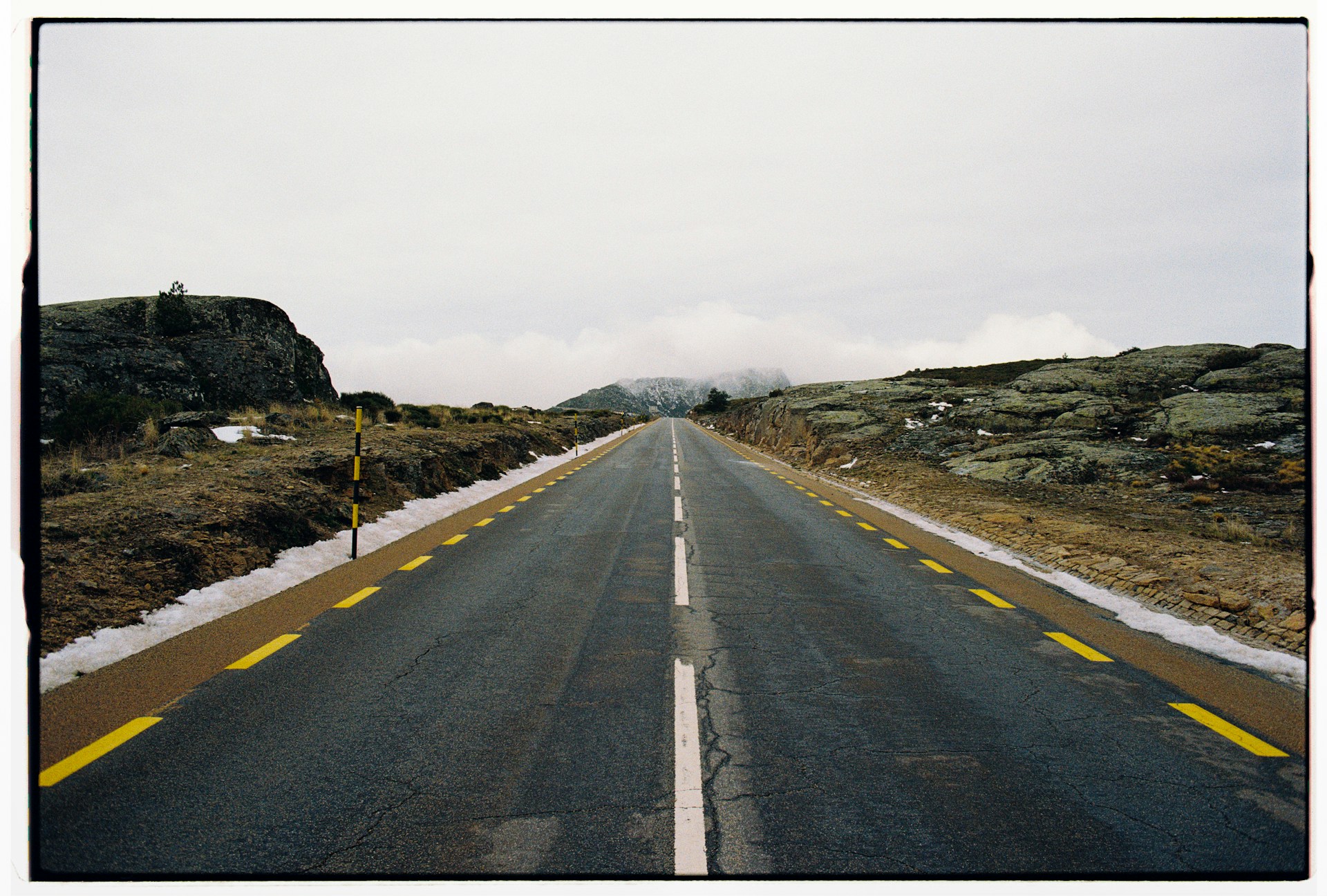
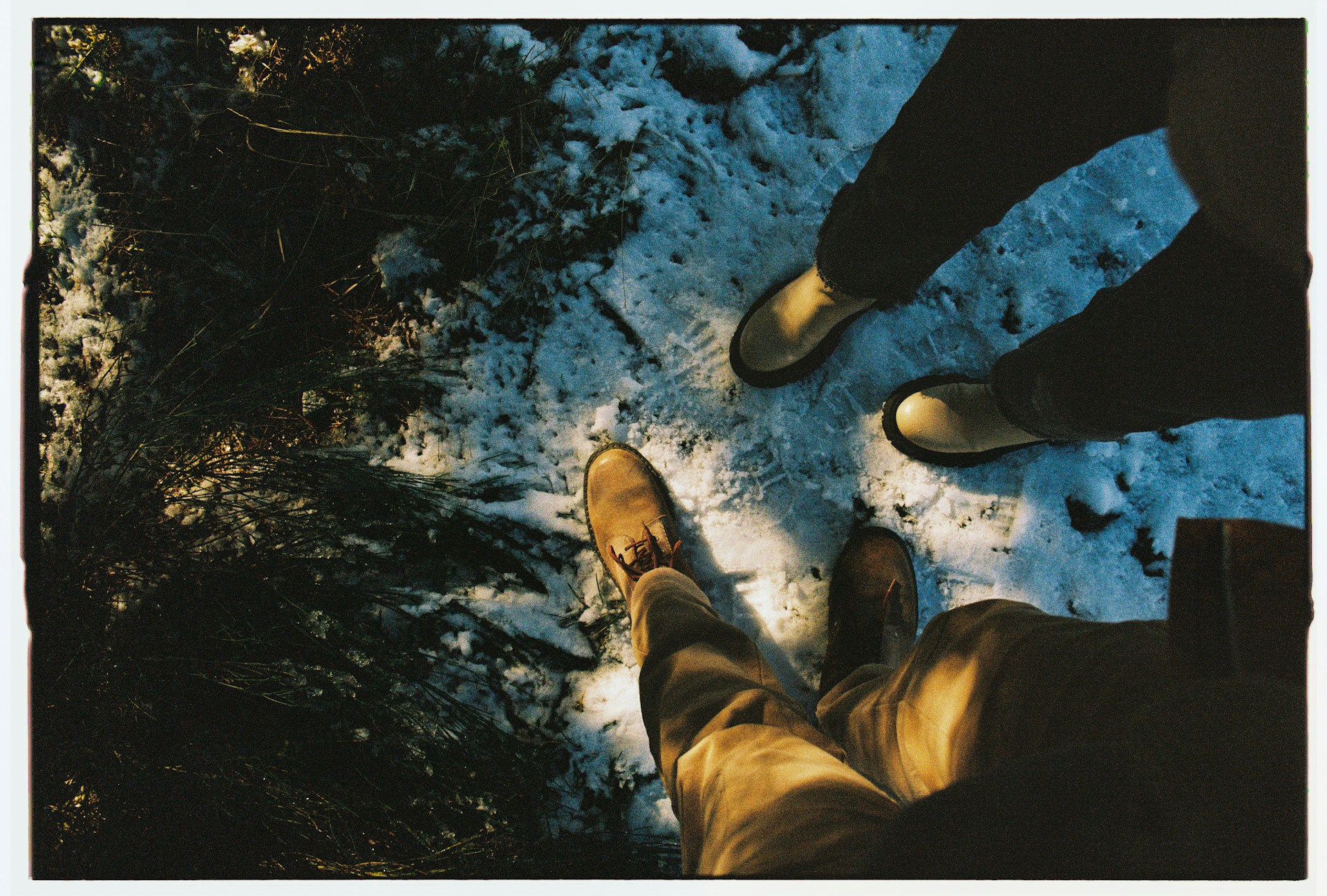
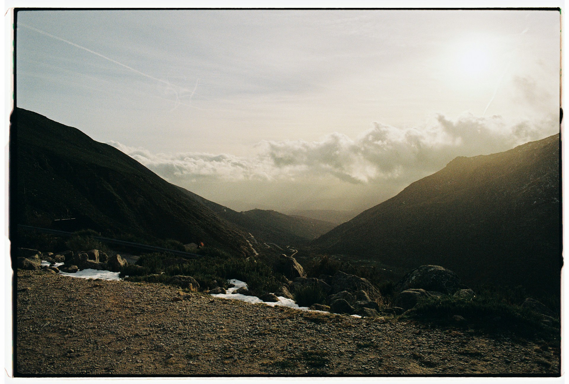
An album is one gallery item that opens a set of photos in the lightbox rather than a single picture. The three tiles above are albums. A stacked-images icon marks the cover, and the click opens that set. Sixty frames from one trip take one tile in the grid.
The usual alternative is a page per set, or a taxonomy grid whose tiles link to category archives. Both send the visitor to a new page before the second photo. An album keeps the browsing in the lightbox, which suits a photographer with a dozen shoots and one portfolio page. Pick the archive route when a set needs its own URL and text.
What fills an album, and what the popup does with it
Album Images is the field that holds the set. Which screen it appears on, and whether you fill it by hand, depends on the source.
- With the Media source, open an image inside the block, set Format to Gallery, then pick the photos in Album Images. A hand-picked album has no limit.
- With the Posts source, set the project Format to Gallery and choose Album Images in the sidebar. Left empty, the images attached to the post are used, up to 50.
- The Taxonomies source builds each term’s album from the album images or featured images of its posts, newest first, up to 50, cached for an hour.
- Display Gallery Icon, in the skin Overlay section, is on by default. Display Images Count in the Elements section prints “12 Images” on the cover.
- Media Object Priority in Click Action lists Album above Image by default, so an album item opens its set rather than its own cover photo.
- Isolated Album Popup, on by default, keeps the lightbox to that one album. Switched off, every gallery item and every album image run as a single sequence.
- Album Lazy Load Threshold defaults to 20 and takes 5 to 100. Images past that number arrive over the REST API when the album opens, 50 at a time.
Making an album in three steps
- Add the Gallery block, choose Media as the content source, click Add Media and select one cover image per set. The demo above uses Masonry and the Classic skin, so the caption sits under each cover.
- Click a cover in the list under the Add Media button to open its Media Settings. Set Format to Gallery and pick the set in Album Images. Drag the images to order them, since Order by starts on Manual.
- Set Click Action to Popup. Leave Album above Image in Media Object Priority, and keep Display Gallery Icon on so an album tile reads differently from a plain photo. The rest is in the Albums documentation.
Album items sit behind the license
The grid on this page is free. The albums in it are not. Masonry, the Classic skin, the Media Library source and the lightbox ship in the free plugin, so the page builds without a license. The tiles would open one photo each.
- The Gallery format and the Album Images field are Pro, on media items and on projects alike.
- So is the taxonomies content source, which produces a term album without an Album Images field.
- Deep linking, also Pro, gives each album image its own address, so a shared link opens on that slide.
- Pro contains the free plugin, so there is one thing to install and galleries carry over. The full split is in the free versus Pro table, and the license tiers are on the pricing page.
Album gallery questions
Can one item open several images?
That is what an album is. Set the item Format to Gallery and pick the photos in Album Images, in Media Settings for an image or in the sidebar for a project. Taxonomy items skip the picking and pull the images of their posts. Steps in how to make one item open several images.
Can the lightbox show a different photo than the cover?
For an ordinary item, yes. Custom Popup Image in Media Settings replaces the picture, and Display Image Priority in Click Action decides which candidate wins. For an album item that field is ignored, since the click opens the set. See showing a different image in the lightbox.
Are the Media Library titles and captions used?
Only when you ask for them. Items Title Source and Items Description Source accept Image Title, Caption, Alt and Description, and default to Custom, the text typed in the block. Album photos in the lightbox follow the block Title Source and Description Source, both off in the demo above, so the popup shows the photo alone. More in how the Media Library texts are used.